The Importance of Color Choice in Brands
Color matters. We see color or lack thereof in brands daily. The color or color pallet of a brand is often selected with care and intent and if it isn’t it should be. Evoking an emotion with a logo and brand can be tricky; often color is used as a subconscious hint of that emotion. Color is not the only contributing factor – typography, style, icons, words, graphics and images also can be added to enhance your brand. Don’t forget there is an entire audience that is either color blind or color deficient. A brand’s color choice can affect the way we perceive companies and their products/services.
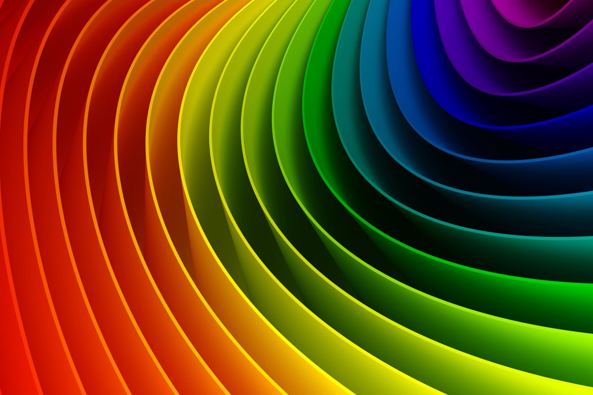
History, theories and researchers debate on the meaning and use of color. What does your color say about your brand?
Brown relates to stability and honesty. When we see brown we think of the earth since brown is the dirt under our feet. Companies that use brown are trying to make consumers think they will get the job done with a no nonsense attitude. Other times when companies use a silkier looking brown it is to symbolize class and eloquence.
Purple is seen as the color of royalty and success. The earliest purple dyes date back to about 1900 B.C. It would take 12,000 shellfish to extract enough to dye a single garment. Since the dye was so rare it became something only available to the wealthy aristocrats. When a brand uses purple it is to symbolize their companies excellence. Purple can also be seen as a color of maternity and comfort.
Blue symbolizes loyalty and honesty. The color blue makes people feel calm and comfortable. Many religions use the color blue to make people feel at home in their places of worship. When brands use blue it is to create a calming brand loyalty with them.
Green symbolizes natural and calming feelings. Green is many times paired with yellow to connote a fresh natural approach to a problem. If a company uses green they often are trying to calm you and persuade you to want their products.
Yellow is an uplifting color connoting new and fresh ideas. Yellow is used many times to symbolize spring. When companies use yellow it is to grab your attention with their fresh ideas. Many times older people don’t like yellow because it vibrates very quickly.
Orange symbolizes bold and joyful feelings. Orange can make people feel invigorated and ready to tackle an issue, it relates to our gut reactions. When a logo is orange it is to produce a gut reaction toward the product and make you feel excited.
Red implies power and speed. Red can be related to getting things done, it can also be seen as sexy or important. In many cultures red brings luck and fortune. When a company uses red in its advertising they are trying to catch your eye. Showing you they are the authority on what you need.
As you can see a color can mean or imply something completely different than you intended. Although this is a sample list and generalization of what a color can mean to a person, the point of sharing is to draw attention to the fact color matters. Not only will color help make you look good but also appeal to the right audience. So when it comes time to share you brand, logo or advertisement…. Make sure your web and print team actually print the right color! Yes, it is that important.