Orange symbolizes bold and joyful feelings. Orange can make people feel invigorated and ready to tackle an issue, it relates to our gut reactions. When a logo is orange it is to produce a gut reaction toward the product and make you feel excited.
Gatorade and Nickelodeon use orange to excite their markets. When you see the Gatorade Orange you want to get up and do something and do it well, you want to be active. The Nickelodeon logo is beloved by kids they see and it immediately gets them excited about the show that will come on right after.
Other companies that use orange include:
- Fanta
- Gulf
- Payless
- Amazon
- Blogger
- Boost Mobile
BRANDS THAT USE ORANGE
Brands that have chosen to use the color orange in their logo, branding or products know their audience. Companies that have strategically chosen the color and flavor orange for their demographic of children include: one of the first colors and flavors chosen for Jell-O Orange and Orange “Crush” soda pop and Popsicles.
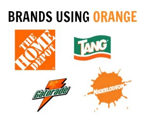
- Home Depot: Designed with the color orange to inspire activity and productivity, especially within the home.
- Tang: The logo of this popular fruit-flavored drink is paired with the color green, representing nature and drawing direct ties to citrus.
- Nickelodeon: The use of orange in this logo is vivid and overpowering, but in a fun way connects with the demographic it was designed for, making it the right choice of color.
- Gatorade: Connected with athletics and fitness, the Gatorade logo is another example of an orange logo that promotes activity and energy.
Check out our Pinterest Board for ORANGE inspiration!
At DRS we appreciate the importance of color and how getting the color right in signs, posters and banners is to our customers. Color has impact. Trust DRS to make the most of your color graphics.
Trackbacks/Pingbacks