by PrintDRS | Jul 31, 2015 | Blog, Colors
Color matters. We see color or lack thereof in brands daily. The color or color pallet of a brand is often selected with care and intent and if it isn’t it should be. Evoking an emotion with a logo and brand can be tricky; often color is used as a subconscious hint of...
by PrintDRS | Mar 21, 2014 | Blog, Colors
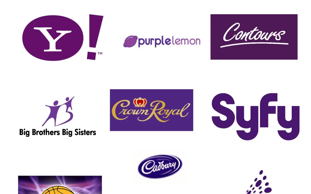
Purple is seen as the color of royalty and success. The earliest purple dyes date back to about 1900 B.C. It would take 12,000 shellfish to extract enough to dye a single garment. Since the dye was so rare it became something only available to the wealthy aristocrats....
by PrintDRS | Mar 14, 2014 | Blog, Colors
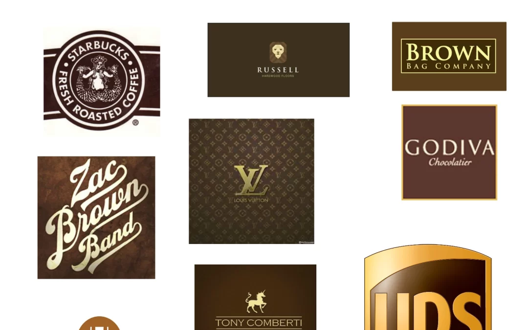
Brown relates to stability and honesty. When we see brown we think of the earth since brown is the dirt under our feet. Companies that use brown are trying to make consumers think they will get the job done with a no nonsense attitude. Other times when companies use a...
by PrintDRS | Feb 21, 2014 | Blog, Colors
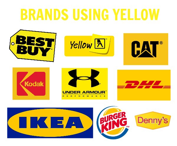
Yellow is an uplifting color connoting new and fresh ideas. Yellow is used many times to symbolize spring. When companies use yellow it is to grab your attention with their fresh ideas. Many times older people don’t like yellow because it vibrates very quickly. Best...
by PrintDRS | Jan 17, 2014 | Blog, Colors
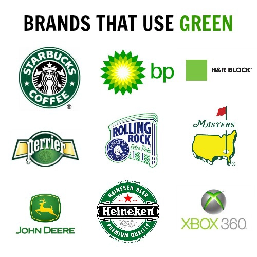
Green symbolizes natural and calming feelings. Green is many times paired with yellow to connote a fresh natural approach to a problem. If a company uses green they often are trying to calm you and persuade you to want their products. Whole Foods along with Land Rover...
by PrintDRS | Jan 10, 2014 | Blog, Colors
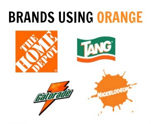
Orange symbolizes bold and joyful feelings. Orange can make people feel invigorated and ready to tackle an issue, it relates to our gut reactions. When a logo is orange it is to produce a gut reaction toward the product and make you feel excited. Gatorade and...