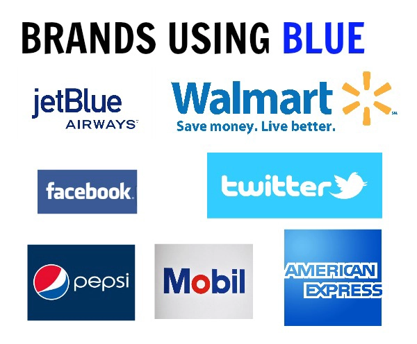
by PrintDRS | Jan 31, 2014 | Blog
Blue symbolizes loyalty and honesty. The color blue makes people feel calm and comfortable. Many religions use the color blue to make people feel at home in their places of worship. When brands use blue it is to create a calming brand loyalty with them. From Facebook...
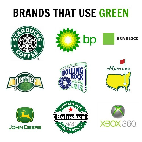
by PrintDRS | Jan 17, 2014 | Blog, Colors
Green symbolizes natural and calming feelings. Green is many times paired with yellow to connote a fresh natural approach to a problem. If a company uses green they often are trying to calm you and persuade you to want their products. Whole Foods along with Land Rover...
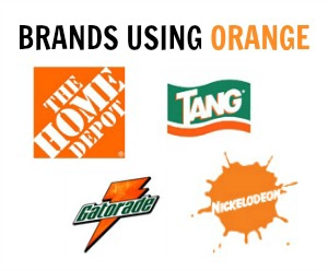
by PrintDRS | Jan 10, 2014 | Blog, Colors
Orange symbolizes bold and joyful feelings. Orange can make people feel invigorated and ready to tackle an issue, it relates to our gut reactions. When a logo is orange it is to produce a gut reaction toward the product and make you feel excited. Gatorade and...
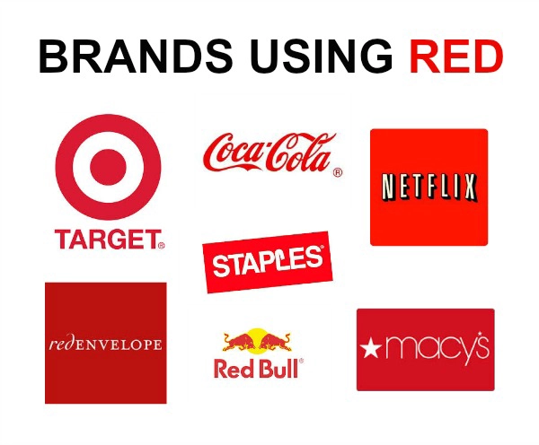
by PrintDRS | Dec 9, 2013 | Blog, Colors
Red implies power and speed. Red can be related to getting things done, it can also be seen as sexy or important. In many cultures red brings luck and fortune. When a company uses red in its advertising they are trying to catch your eye. Showing you they are the...
by PrintDRS | Dec 8, 2013 | Blog
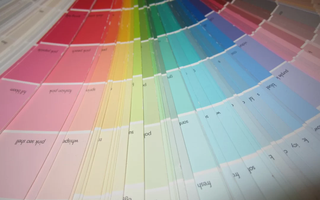
Welcome to our series of Understanding the Psychology of Color. We will be breaking down each color discussing the psychology, brands using it and the importance of printing the right color. Understanding how color can influence people’s mood and behavior can be a...
by PrintDRS | Oct 29, 2013 | Blog
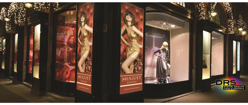
Just like a picture can say a thousand words, so can the right signage. However, like most things there are rules to follow if you want to maximize the effectiveness of your signs. The first job of a sign is that it has to be noticed. This may sound elementary to...